White LEDs are the most common form of sign backlighting and are being used in applications from channel letters to cabinets and graphic advertising boxes. However, not all white LEDs are created equal. There are a range of hues, from a yellow-red to a blue-white coloration. Depending on the application, these color variations can have a significant impact on the effectiveness, perceived “brightness” and quality of your sign. In this article, we will provide an overview of color temperature and color rendering and how to choose the correct “color” of white to optimize your sign application. First, we need to define some key variables.
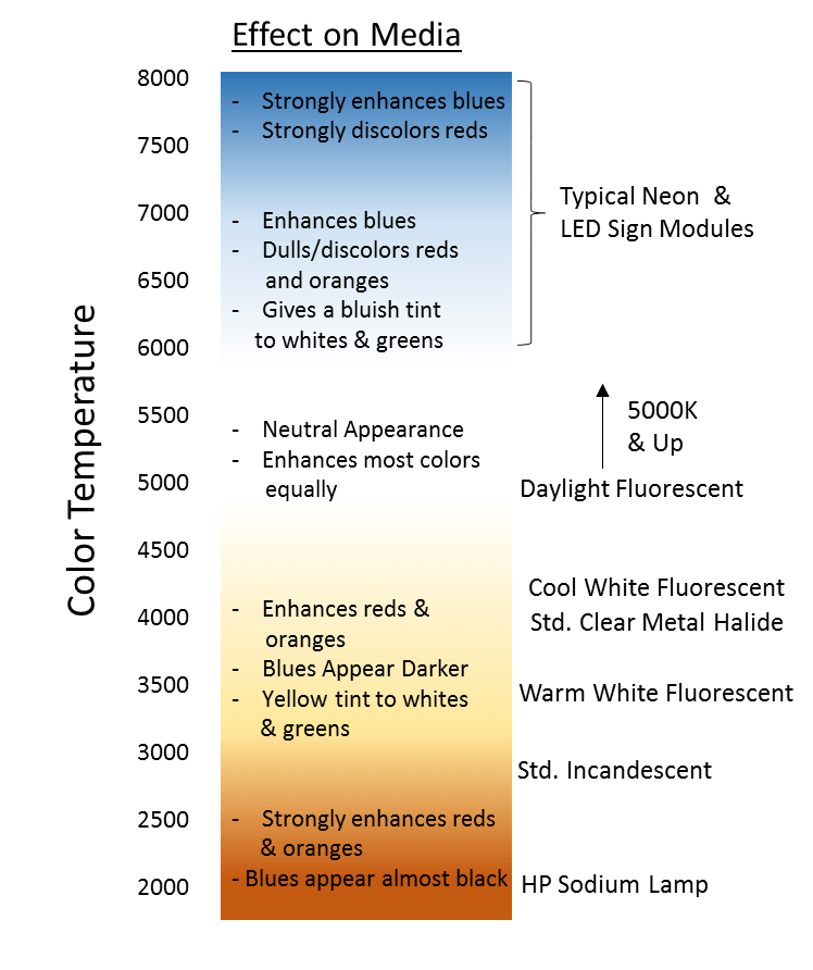
Color temperature (CCT) is a description of the warmth or coolness of a light source. When a piece of metal is heated, the color appears red in appearance and gradually changes color to orange, yellow, white, blue-white, and finally a deeper blue color. The temperature of this metal is a thermal measurement in degrees Kelvin or absolute temperature. While LED lighting does not perfectly match the output of this piece of metal, we use this convention to describe the appearance of light as it relates to this type of black body radiator. The sun is an ideal blackbody radiator and above atmosphere has a CCT of about 5900K. Depending upon the time of day and conditions, the CCT we see varies between 5000K at horizon daylight to 6500K during overcast conditions. In general lighting, warmer CCTs which mimic candlelight are used to create relaxation and enhance skin tones, while cooler CCTs are used to enhance concentration in office environments (Figure 1).
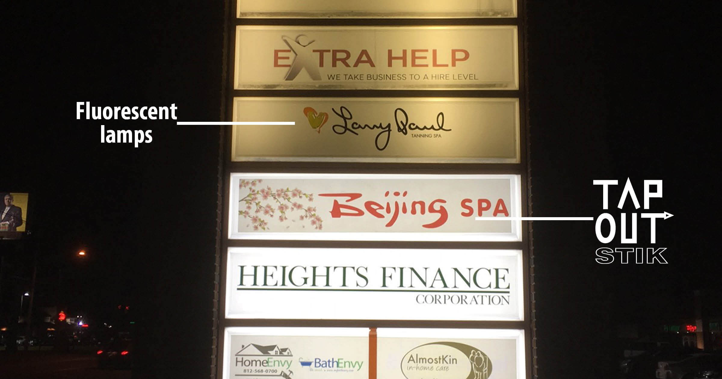
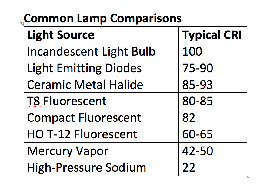
Color rendering index (CRI) is a quantitative measure of how well a light source renders colors versus an ideal blackbody radiator. Without getting too technical, it is calculated by taking eight CIE standard color data points and comparing them to a standard. A general CRI (Ra) is calculated by taking the arithmetic mean of these points. The smaller the average difference in chromaticities versus the ideal standard, the higher the CRI. A CRI of 100 represents the maximum value. A table of typical CRI values of various light sources is shown in Figure 2.
Let me make an important point. Higher CRI does not mean “better”. Where CRI is important from a sign perspective is when you are back-illuminating graphics. Typically, a CRI value greater than 80 is more than acceptable. However, one should consider the graphic as well. Sometimes color appearance (typically determined by CCT) is more important than color fidelity (CRI). For instance, say you are trying to highlight a burger and fries, it may be more important to highlight warmer tones, even at the expense of a higher CRI. You may be surprised how well an 80 CRI product performs and may be disappointed with a 90+ CRI product depending on the graphic. As a general rule, when looking at LED backlighting for graphics, CCTs in the 4000-5000K range and above 80 CRI are the most versatile and will do a good job of lighting both warmer and cooler colors at high fidelity.
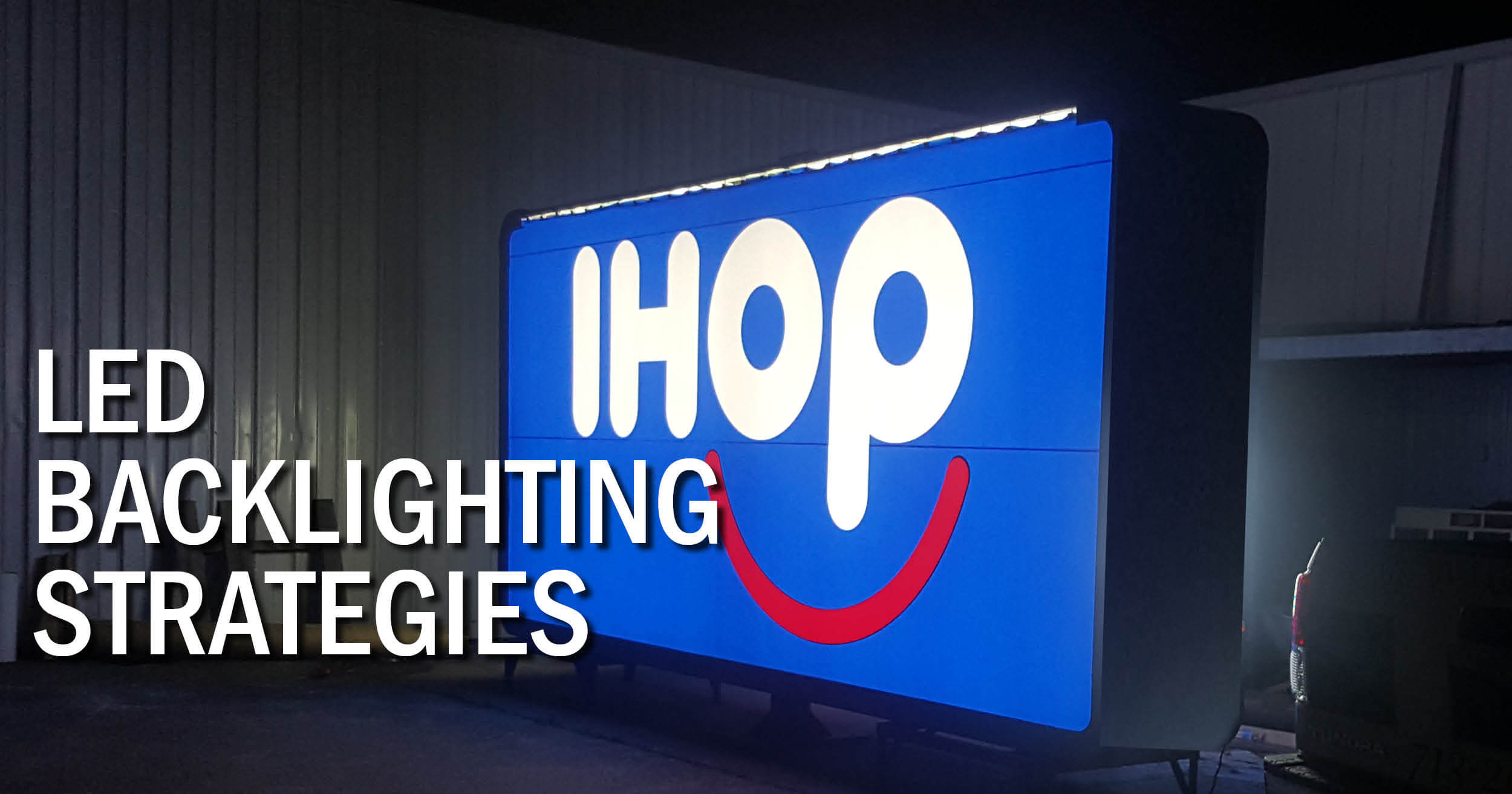
So what about cabinet lighting and channel letters? Here the decision is in some ways simpler. First, CRI values are of less importance. The only general caveat is that warmer text and print (red, orange, brown, etc.) render better at lower CCTs (4000-5000K) and cooler colors (blue, green, etc.) render better with higher CCTs (6000-7500K). Temperatures below 3500K and above 7500K are typically not recommended because they can cause significant color copy shift. For instance, a 9000K LED can give red copy a purple hue and 3500K copy can make blue copy look greenish. If there are colors other than white on the sign, it is a good practice to use LEDs between 6000-7000K, which is the part of the color spectrum with the least amount of hue variation.
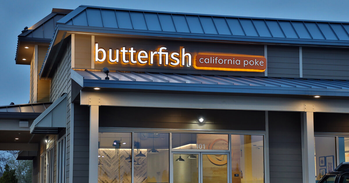
White channel letters are completely a matter of preference. Often I see many sign companies and end users leaning towards the 6500-7500K CCT range. The reason is usually perceived brightness and getting a “white” white. If you take a 4000K LED and a 7000K LED at the exact same lumen brightness and backlight a piece of white acrylic and ask someone which is “brighter,” almost everyone will point to the higher CCT LED. This has to do with the human eye and the sensitivity differences of the rods and cones in our eyes. Most people view signs at night and peak scotopic vision is around 510 nm (in the blue-green region). So even though the total lumens count is the same, the apparent or “scotopic” lumens that the eye sees is about 25-30 percent higher at 7000K versus 4000K. This factor should be considered when “brightness” is key. The higher the CCT, the higher the scotopic brightness. Like anything, however, this can be taken too far. Some “bright” import LEDs are often in the 9000-12000K range. This very strong bluish purple hue and can create a very harsh lighting effect. While this may seem like the best choice in the shop, when it goes into the field, it can look very “purple,” especially if other lower CCT signs are in the area or nearby. The human eye is very sensitive to shade variation (we can actually see about 300 shades of white). Therefore, I recommend the use of LED modules for generic channel letters in the 6000-75000K range to give an attractive eye-popping effect. Warmer colors (3000-4000K) should be used when the client is trying to achieve a less intrusive, softer and more inviting effect. A neutral effect can be achieved in the 4500-5500K range.
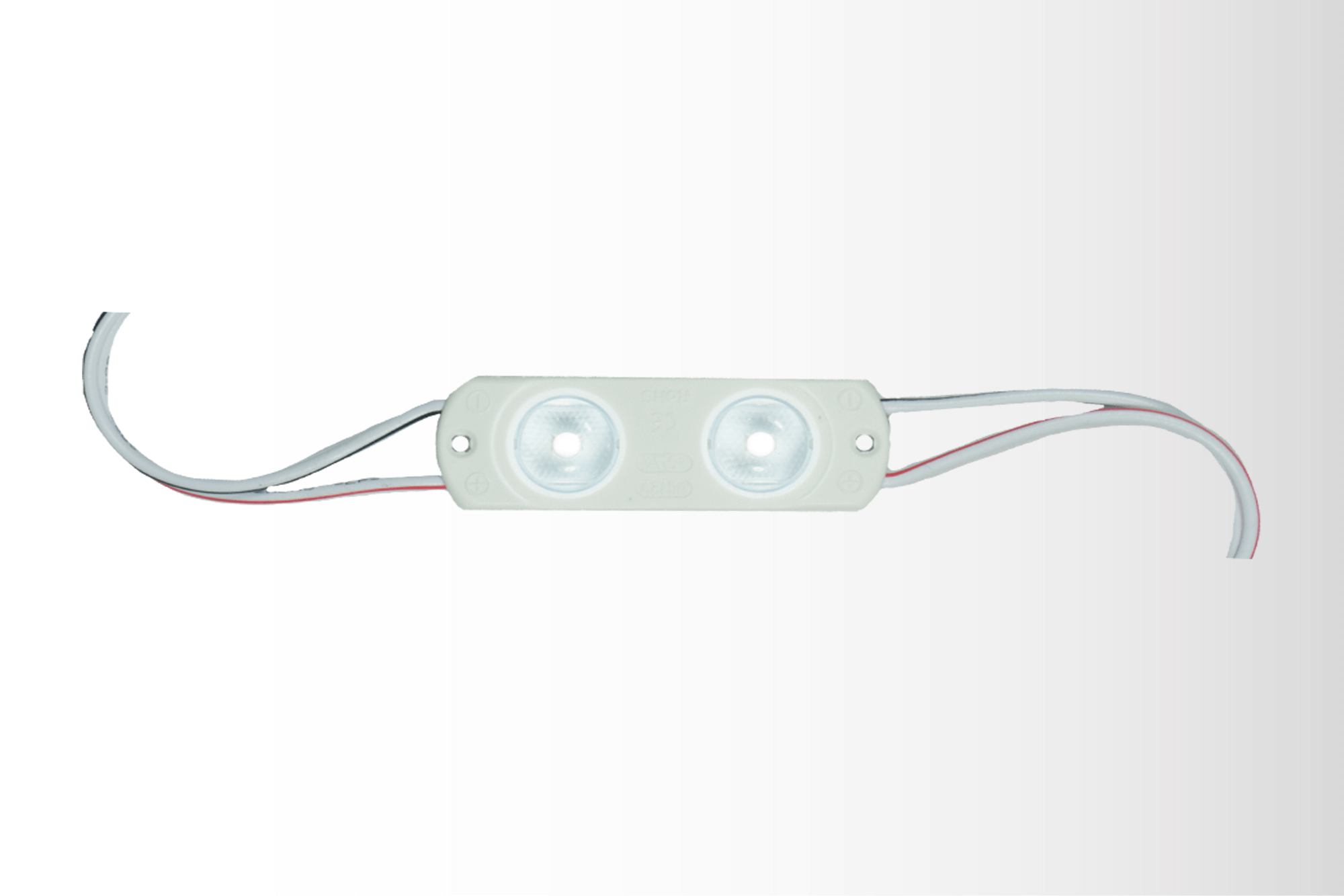
Most LED manufacturers offer a range of color temperatures. Having a variety of options of white can help you in the prototyping process and eventually secure business by being able to meet the color effect the customer wants to achieve. We recently released our Fusion Freedom module. (Check out a short demo video or watch our on-demand, in-depth webinar about Fusion Freedom.) This universal module not only has three brightness options built into the same module, but allows the sign company to change colors and color temperatures using a removable lens system. The base module has lenses that provide 10 different color temperatures from a 2700K incandescent white up to 9000K cool white. “This product gives the sign company the ability to stock one base 6500K module and then apply lenses when they want to generate different colors or shades of white. Over 30 stock colors and CCTs lenses are available,” according to Jeff Brazin, vice president of national accounts. “Sample kits are available to help sign companies demo the system to customers and help them choose the right color that meets their desired image. We can even provide custom lenses that are color matched to a corporate image for national chains,” adds Brazin.
Understanding both color temperature and color rendering are important when helping your customer achieve the look they desire. In the case of graphics, color rendering and overall fidelity (driven by CRI) is key; however, color tint or hue (driven by CCT) is really a matter of customer preference when it comes to channel letters. Knowing the difference will help you make an informed decision when you build your next LED backlit sign.